More and more brands are designing their products for positive emotions. The reason for this is simple: While brands used to ask questions like “Does this application work?” or even “Does this product work for you?”, there is one more pressing question at work when it comes to user experience. The question is: “How does our product make you feel?”
Positive associations are what makes users coming back, and brands are recognizing and designing for positive emotions.
In this article, we are exploring some ways to design a positive user experience (also known as UX). Don’t hesitate to read up on our full guide to customer feedback, from A to Z.
Why a positive user experience and emotions are key?
Brands are looking to design positive emotions to keep users happy and engaged. An app should be something that is pleasant and evokes feelings of success, accomplishment or joy, rather than negative emotions. But emotions are also more than a fuzzy feeling; they are key to making decisions.
In a recent article on our blog, we explained how a few years ago, neuroscientist Antonio Damasio made a groundbreaking discovery, when studying people with damage in the part of the brain where emotions are generated. He found that they seemed normal, except that they were not able to feel emotions. But they all had something peculiar in common: they couldn’t make decisions.
Emotions are key to making an active decision such as committing to subscribing to a plan, using a product again, and so forth. Positive emotions, therefore, are not just a nice-to-have but have real $$ value for brands.
We all recognize negative emotions when dealing with a digital product such as frustration, anger, or hopelessness. But what about positive ones like happiness, pride, success?
How can brands design for positive emotions and what does that mean for retention and loyalty?
How to design a happy user experience?
Designing for emotions can have various forms, and not everything is right for every brand. In fact, it is important to figure out, what fits your brand and your users. Here are a few examples:
Imperfection
Imperfection has become a significant part of a design. The idea is to make objects purposefully imperfect to give them a human touch and make the brand itself more personal and approachable.
One example of this is the new design of Typeform. When you scroll down the page, the perfect circle around their logo takes on imperfect shapes:
Humor
“Laughter is an instant vacation” (Milton Berle)
Whether you are making your users laugh out loud, smile broadly, grin or just chuckle at their desks, you are winning. Humor is an instant stress reliever and trigger of positive emotions.
Researchers have found that humor triggers the brain’s reward centre and delivers “happiness” hormones such as dopamine, serotonin, and endorphins. But what makes something funny?
Here are a few funny “filters” with examples from B2B apps. If you want to learn more about what makes something funny, I can recommend Scott Dikkers short, but excellent book.
Exaggeration
Often, humor is based on exaggeration. Exaggeration, or hyperbole, takes a familiar situation to an extreme. We all know these times when we have a lot of tasks to manage.
This woman’s hair on Basecamp’s landing page is literally on fire because she has so much to do that her head is smoking.
Character
Seriously, we don’t work for or sponsor MailChimp, even though we mention them so regularly on our blog. 🙂 We just love their humor. Everyone knows their cute mascot and many companies have integrated animals into their marketing.
Another example (among many) is Trello with a recent status page. A sleeping fox is exuding calmness and cuteness.
Analogy
Asana is a project management solution intended to make your life easier with their tool. What’s funny about their landing page copy is the analogy they are using: Yes, you can use their tool (as most people do) for managing digital products, but you could also use it for planning to land on the moon. 🙂
Gamification
Gamification has become a buzzword in UX Design. But what is it actually?
In a Medium post by Tubik Studio it reads:
“In the tech world, the word “gamification” stands for the technique of exerting game mechanics into the non-game environment, such as websites and mobile applications.”
Salesforce has mastered gamification with their Trailhead-program, a program intended to teach yourself how to use Salesforce. You can choose from more than 90 trails that teach you how to use Salesforce products from Marketing to Service Cloud to Quip.
The idea here is to use challenges, quizzes, points, badges and cute illustrations to make learning fun and entertaining.
Gamification is very likely to trigger emotional responses: the Joy of making it to the next level, a sense of accomplishment, success. Brands are rewarding users with digital badges to spend more time in their product and with their services.
Another example of a B2C company who relies heavily on gamification is Fitbit with its various badges.
Like Fitbit, there’s another B2C SaaS brand, called DoFasting, in the fitness niche that uses gamification. But it uses gamification in the lead generation phase of its marketing with a quiz. When you visit the homepage, it asks people to take part in a quiz on fasting and generates a personalized report at the end based on their answers. This helps it better understand its audience and generate leads as quiz participants need to give their email addresses to get the free report.
Illustrations
A lot of digital products include illustrations. And the reason is simple: it is easier to see yourself in a character than in a photo of another person.
Here is the illustration that welcomes you when you are opening Slack:
Happy people, bright colors, and clothes that match the colors of the product are welcoming you to create the work experience you want.
Wrapping it up.
When designing the user experience, one question is most prominent: How does the user feel? There are multiple ways to evoke positive emotions such as curiosity, surprise, or happiness when it comes to designing digital product experiences.
This post was brought to you by Usersnap. Usersnap helps you work together with your team on customer feedback management, communicate effortlessly, and build your products of the future for your customers.
Close the Feedback Loop with Actionable Insights
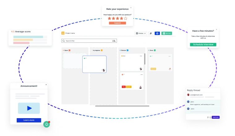
Building great products starts with customer feedback at every stage of your
Product Development Lifecycle (PDLC)
- 🚀 Capture insights effortlessly—from feature discovery to post-launch improvements.
- 📊 Turn feedback into decisions—prioritize requests, track issues, and refine the user experience.
- 🔄 Iterate faster—validate ideas, reduce friction, and keep customers engaged.
Usersnap helps you collect, manage, and act on feedback—seamlessly.
Sign up today or
book a demo with our feedback specialists.