Building a web page or web app takes a lot of time, resources and patience. I get that. And because of these reasons, the little things get overlooked.
When building a new website or application, you probably count your website form as one of those little things.
But it really shouldn’t be overlooked, this little thing.
That is why I’m going to talk about the UI mystery of web forms and how you can build an awesome form for your website yourself.
What is a web form?
Before we take a look at the UI of great and bad forms, we need to come up with a common understanding of what a website form is.
According to Wikipedia, a form – or web form – can be defined as the following:
A webform […] allows a user to enter data that is sent to a server for processing.
Or as W3C would describe it:
The form element represents a collection of form-associated elements, some of which can represent editable values that can be submitted to a server for processing.
Forms can therefore have various options and fields. A form can used for entering payment data, or it can be used to search for a keyword on a search engine.

To sum it up, web forms are a useful tool for tracking certain information from your website visitors.
And they are probably the most important element on your website when it comes to achieving your business goals.
Modern elements of web forms
Typically, forms are made up of all kinds of different input fields. Nowadays, the following form elements are quite common in a website form.

and many more.
As seen in the example below, we’re making use of radio buttons in order to let our website visitor choose the preferred pizza size:
<form>
 <p><label>Customer name: <input></label></p>
 <fieldset>
  <legend> Pizza Size </legend>
  <p><label> <input type=radio name=size> Small </label></p>
  <p><label> <input type=radio name=size> Medium </label></p>
  <p><label> <input type=radio name=size> Large </label></p>
 </fieldset>
</form>
What’s the design goal?
Websites always have a purpose. This purpose could be something as simple as to inform people about something.
Or entertain them. It could also be that the purpose is something more direct and the website wants you to buy something or even actively help you achieve something.
For many businesses, the website becomes a sales funnel. And the contact form might be your call to action.
The current state of web forms and how to design them.
If you’ve ever looked into it, you’d already know.
The differences between a great form and a bad one can be almost too subtle to notice or even be completely counterintuitive.
The color of a button, the placement of the form, you name it, everything seems to have an impact on a form’s performance. It’s hard to give specific guidelines on designing web forms since there’s no one true solution. But there are some best practices that give you a great idea of where to start.

(login form on invisionapp.com)
(sign up form on typeform.com)
Place the form somewhere relevant
When talking about great form designs we have to consider the user story. Forms can be bad not because of design or copy, but because of where you place them.
Your subscription form should be placed near the part that tells them about what to expect. It’s all about flow, and your form’s placement is key to converting your users and keeping them in that flow.
Some examples of bad forms can be found on badforms.com:

Contrast is your friend
Once you’ve guided your audience to the form, make sure that it stands out on its own.
Your users should know something’s expected from them just from the look of the form. Use colors to your advantage to make it stand out. Contrast is your friend.

(source: http://badforms.com/labels-inside-fields/)
Copy has a style as well
Text should stand out and be readable.
The styling should be consistent and well thought-out. Most importantly, the position of the text and how it’s represented can make a huge difference to your conversion rate.
Content is king
You’ll probably be telling people all about your product or service. While the design part of the web form has a big impact on making it stick out and making it “feel” relevant, the copy actually makes it remarkable and is what convinces people to click through after they’ve had that first glance.
Now, copy goes beyond just the words and here too, styling makes a difference.
Simple things like font colors and background colors can make or break a form.
But even font sizes, copy placement and other seemingly small elements can have a tremendous impact on the performance of the form.
When you know that, there are also couple of things you should think about when you’re designing web forms which are really only due to the content, not the styling.
- Content should be relevant – If you made a promise, keep it and make sure the form reflects it. The link between what your users just read and what you’re asking for must be clear.
- Content should be concise – No one has the time, so making your copy to the point and as clear as possible is key. Keep in mind, any reason to doubt the purpose of the form or any ambiguity can have a huge impact.
- No errors – This is true for any copy, but forms get a lot of extra attention from your visitors. That’s why your forms should be completely without errors and in this way, instil trust.
Size matters.
No one likes spending a lot of time filling out a form.

Making sure you only ask for the most relevant information is pretty key to your conversion rate.
But it’s important to understand that the form length isn’t the only factor to keep in mind. The purpose of the form is pretty important as well. As it happens, people seem to be pretty happy filling out a long form for a survey or for a contest, but not as happy filling out a purchase or a contact form.
To go around the limitations of form length, a social login can help quite a bit already. Your customers only have to click a button and a site they already trust keeps their data. It’s a win-win.

However, when you need more information you’re still going to have to ask for it.
- Ask only what matters most – Leave out the things that are nice to have and focus on what you really need. You can ask for those details later, when the relationship has improved or when it matters more to the user.
- Group and simplify – Group the different options where possible and make sure they’re organized. Use checkboxes instead of asking people to type and make it clear what data goes where.
- Data validation – Validate the information as your user types it in. It give them a feeling of confirmation that they’re doing things right and aren’t filling in a form only to realize they’ve made a mistake and have to start all over again.
All in for testing.
Put it into practice and start testing. Here’s where the actual work comes in.
You’ve designed the entire form, added the perfect copy and you’re ready to go live.
But as I said before , there are no certainties when it comes to form design. The smallest changes can have the largest impact. That’s why the first step you need to take is to test out your forms.
A/B testing of web forms?
You’ve probably thought of more than one piece of copy for your website’s forms. That means you have different headlines that might work, different calls to action for your form buttons. But there’s more to it than that.
Changing things like field lengths, form location, size and general styling are all things you can test.
So does that mean you should? If there’s even the slightest doubt, there’s only one way to find out. Simply create an account with Optimizely or host your site at Unbounce and start testing.
Get yourself a test plan
A/B testing your sign up and contact forms won’t get you anywhere, if you’re not making sure to have a test plan in place.
So what should go into a great test plan for testing your web forms?
- What are we testing?
- Which pages/URL/forms must be tested?
- Who are we testing for?
- Which browsers are supported by our web forms?
- Which mobile devices + browsers are supported?
- Which screen resolutions are supported?
- What are our limits…
- concerning time?
- concerning money? (Who pays for testing & quality assurance?)
- concerning scope? (Which devices can be left out and which pages don’t need to be 100% perfect?)
Wow…that was a lot.
I know this was quite a lot and probably way too much to grasp at once. So what are my key learnings when it comes to designing great web forms?
- Make sure that your web form has one (and only one) purpose
- Make sure that this purpose matches the user story on your web page
- Place your forms somewhere relevant. Meaning: place them where the user should and will find them.
- Content & size matters.
- Over-invest in designing your web forms.
- Put your forms out into the wild for testing. Without proper testing you won’t get anywhere.
This article was brought to you by Usersnap – the #1 customer feedback platform – and feedback platform (QA, UAT) for every web project. Say hi on Twitter.
Close the Feedback Loop with Actionable Insights
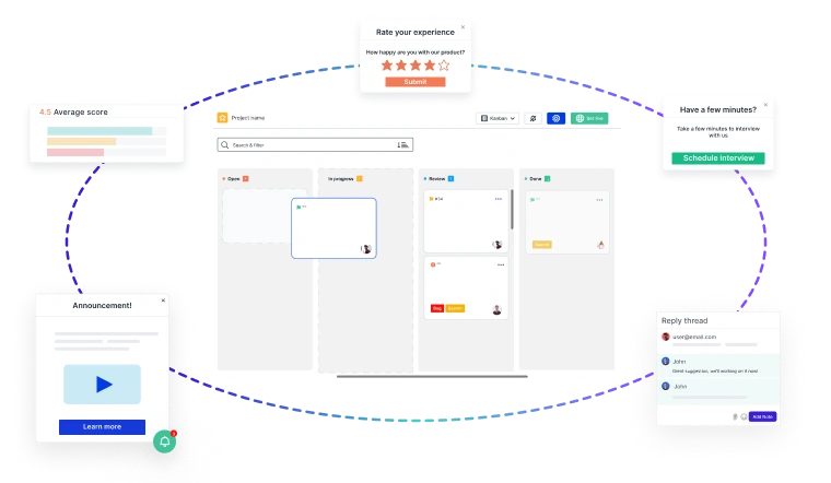
Building great products starts with customer feedback at every stage of your
Product Development Lifecycle (PDLC)
- 🚀 Capture insights effortlessly—from feature discovery to post-launch improvements.
- 📊 Turn feedback into decisions—prioritize requests, track issues, and refine the user experience.
- 🔄 Iterate faster—validate ideas, reduce friction, and keep customers engaged.
Usersnap helps you collect, manage, and act on feedback—seamlessly.
Sign up today or
book a demo with our feedback specialists.