An appealing user interface can have a significant impact on the success of your application.
The challenge for web designers is thinking about how users are navigating the UI and which actions they expect to happen. This involves evaluating the skills and technical know-how which they can expect from their users.
We will give you a few tips about how to design an appealing UI and ensure a good user experience.
1. Intuitive Navigating
The most important thing about a good UI is that it gives the user the opportunity to navigate effortlessly and intuitively.
But what does navigating intuitively even mean?
Users should be able to use the application without having to spend a long time searching around. The question “how do I do this?” should therefore not even come up.
On the other hand, there are actions that have been learned through cultural conditioning: You know what a hamburger icon means, and you have learned by now, that many pictures contain “ghost links” that lead to articles.
The question is, therefore: how can I use things that have been learned through cultural conditioning to enable effortless navigating? Design changes are also always best when they are aligned with already established patterns.
Non-intuitive navigating is the exact opposite. It always appears when design is developed in contrast to culturally learned things.
Think about this for example:
Why are the buttons so confusing? Because they are designed in a non-intuitive way.
For one thing, the font of the “No” button is a lot bigger, implying that this is the message that is really important.
In addition, choosing the color red for a confirming action is extremely misleading, as we have learned to associate this color with actions that abort something.
The design is therefore in contrast to the expectations a user has of certain actions. Text and design should always confirm each other instead of contradicting each other.
2. How Do Users Navigate Your UI?
Before you start to design a user interface, think about how your users will navigate with it. Which gestures or interactions will they use, especially on touch-based mobile devices.
- Should your users click a button?
- Swipe from the right or from the left?
- Are you offering a drag & drop function?
- Are there forms that have to be filled out?
These are all decisions that you should incorporate into your concept.
The questions you should already ask yourself during the creation of your concept are the reason, why web designers are switching from static design concepts to interactive prototypes and create experiences.
3. Feedback for Your Users
Your users expect reactions or feedback to certain actions. When a user fills out a form, he or she will expect some sort of confirmation.
Feedback can exist or be expected in many different forms. This is another area, where it’s worth to think about creative solutions. If somebody is landing on our 404 page, for instance, then they will be greeted with the following screen:
4. Anticipating Mistakes
It’s not a secret that we are big fans of MailChimp, one of the email outreach tools that could be useful here at Usersnap.
The communication of brands and the design especially are two things that keep delighting us. Before sending out an email campaign with MailChimp, you are presented with this screen, making sure you really want to send out the campaign.
5. Established Symbols
As a designer, you probably want to let your creativity run wild. But despite this, you should not try to reinvent things like the “tray” icon or the “like” symbol. There are many standardized symbols that have become part of our everyday life, and which are connected to very specific functions. For iOS or Android apps, there are official style guides that explain them.
On the other hand, there are symbols that are less established, like the one for changing languages for example. The globe icon is another example that is not established in a definite way. Facebook uses it to display news. You can read more about this in our article on this topic.
Conclusions
For an appealing UI, it’s important to design an interface that is easy to learn. This can be done by using standardized icons, giving feedback after actions, and through intuitive user design. Your UI should be easy to understand and make using the application fun without having to spend a long time learning how to use it.
We at Usersnap hope that you like this post and would love it if you follow us on Twitter. We tweet about web development, web design and UAT on a regular basis. Usersnap is a bug-tracking and screenshot tool for every web-project. Get immediate feedback from the visitors of your websites. Try it now for free.
Close the Feedback Loop with Actionable Insights
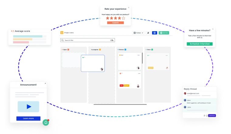
Building great products starts with customer feedback at every stage of your
Product Development Lifecycle (PDLC)
- 🚀 Capture insights effortlessly—from feature discovery to post-launch improvements.
- 📊 Turn feedback into decisions—prioritize requests, track issues, and refine the user experience.
- 🔄 Iterate faster—validate ideas, reduce friction, and keep customers engaged.
Usersnap helps you collect, manage, and act on feedback—seamlessly.
Sign up today or
book a demo with our feedback specialists.