Web design has changed so much in the last years and we can’t wait to see what 2026 will bring. While 2025 was all about minimalism, 2026 brings back bold typefaces, vibrant colors, and new possibilities for users to interact with design. More than ever design tries to catch our attention and keep us focused and engaged while browsing on a website.
But see for yourself what is changing!
Here are 6 outstanding web design trends in 2026
1. Bold typefaces
Bold typefaces are here. Big letters draw us into powerful headlines surrounded by a lot of whitespace. For everyone who always had a knack for the anatomy of a character, 2026 is going to be their year. By the end of 2025, we will all know what the ascender, ear, and loop of a character are.
Bold typefaces are not just aesthetically pleasing. They also have an impact on reading speed, reading comprehension, and user perception.
A study undertaken by Google/IBM showed that the serif font Georgia was read 7.9 percent faster than Helvetica.
Even though there are studies that show how people think they have better text comprehension using fonts with serif, the opposite was actually true. Testers scored higher on reading speed and comprehension using sans serif fonts such as Helvetica.
Bold typefaces make a statement. They are easy to read and easy to comprehend. We are excited to see more of them in 2026.

2. Vibrant colors are back!
After almost two years of pastels everywhere, vibrancy is coming back with a vengeance. No more subdued color schemes, the new year is full of contrast, character, and personality.
How colors affect our mood is a subject that has been widely studied. Color has an important impact on our brain, perception, and behavior. According to an infographic by Kissmetrics, 92% of customers say that visual language is the #1 influencing factor of their purchasing decision.
Colors make us feel a certain way and bright, vibrant colors make us feel awake, excited, and alive.
Smashing Magazine called color the second most important aspect of an application (right after functionality).
Like smell, color is such a powerful factor, because it makes us feel a certain way.
By the time we leave a website, we might have forgotten what it says, but we will remember how it made us feel.
Bright colors spark our energy, keep us engaged, and fire up our buying power. They are positive, eye-catching, and they keep our attention.
Design agencies have been using vibrant colors for a while (Hello, yellow!), but in 2026 everyone from small companies to big enterprises is catching on.

Source: Dropbox

Source: Google Squared/Facebook Posting
3. Mastering Mobile Design
With mobile traffic increasing every day, responsive websites have become obligatory in the last years. In 2025, it is time to really master mobile design. The question is no longer: Does our website work on mobile? It is: How is our content presented best on mobile?
80% of internet users are owning a smartphone and they are using it. In fact, the average time spent on mobile devices is steadily increasing and has gone up to over 5 hours per day, according to TechCrunch.
Mastering mobile design and understanding how content can be best consumed on smaller devices will be a key challenge in 2025.
Some key challenges of mobile design are:
- you don’t want your screen to seem cluttered
- you don’t want users to find the same content on their mobile device and on your desktop version
- you want to keep a similar functionality and navigation of content
- you might want to display ads, which are a challenge for mobile
- you want to trigger the same emotions and brand feel your desktop website triggers
Users must love your mobile experience otherwise they will churn. A recent study by Google has shown that essentially no question is too small for users to take out their smartphone and do some research. Be it about toothbrushes, water bottles, or salt (Yes, salt!)
Mobile search for “best” have gone up by over 80+ percent in the past two years, according to the Google study.
One key element to achieve mobile priority is that your content must be easily navigable with one hand. Think about how you are using your smartphone. You might read articles while standing in the bus or subway and you might be texting when walking through supermarket aisles, you might be looking for “the best red wine in 2024” when you are on the way to see a friend. Chances are you are doing some of these things with just one hand.
Google calls these situations “micro-moments”, short situations in which people are turning to their smartphone to get, know, do, and buy.
According to Steven Hoober, 49% of smartphone uses are executed with one hand, not cradled and not two handed. 49 percent of the time are we holding and browsing on our phone.
That means navigation has to be adapted for the thumb to reach every or the most part of the screen.

Thumb zones on different iOS devices. Illustration: Scott Hurff
[otw_is sidebar=otw-sidebar-3]
4. Micro-interactions are getting more subtle
“Nothing big works.” – Victor Papanek
In 2017, we started seeing micro-interactions and we will certainly see more of them in the future. Micro-interactions allow users to interact with a software or application with small gestures.

In his book “Microinteractions” Dan Saffer describes micro-interactions as follows:
“Microinteractions can power an entire app or device, or (more often) exist alongside or inside a larger product. They are the small moments that can be dull and forgettable, or pleasurable and engaging. Every time you change a setting, sync your data or devices, set an alarm, pick a password, turn on an appliance, log in, set a status message, or favorite or Like something, you are engaging with a microinteraction.”
While Saffer describes micro-interactions in very functional terms, they are getting more subtle and more fun.
In iMessage for example, you can ‘like’, ‘haha’, ‘!’ or ‘?’ any text that is sent to you.
Facebook Messenger allows you to increase the Thumb size depending on how long you press the Like-button.
The examples for micro-interactions are endless, but why are companies using them?
Micro-interactions are highly addictive and a lot of fun. They add – what UX designer and author Nick Babich – calls “a human touch”, making tasks more interesting and engaging. Micro-interactions encourage users to interact with a software and have some fun!
5. Visual storytelling: Video will only become more important
Storytelling is getting more personal and video has a crucial role in that.
The numbers are supporting that:
- According to Eyeview, including video in a landing page can increase conversions by 80% and
- if your email subject line contains the word “video” your open-rate will go up by 19% according to Syndacast.
- On average, people spend 2.6x more time on pages with video than without, according to Wistia
Video is the master of visual storytelling, drawing users into scenes, stories, and emotions. It is eye-catching, attention-grabbing, and keeps us focused and engaged.

6. SVG
Put simple: SVG is on the rise and its usage is likely to increase in 2025. With animation getting more popular and SVGs abilities to transform graphics and websites, SVG has gained steady popularity over the last months.
4.9 percent of all websites use SVG, including popular sites by WhatsApp, GitHub, Espn, Dropbox, and the New York Times.
You can see the significant rise of SVG during the last months in this graphic from w3techs.com
Popular use cases for dynamic SVGs are navigation menus and website headers. SVG means the ability to enhance the interface without losing functionality. Navigation items or text are use cases for SVG.
Here is one of my favorite examples: If you click on “Hover” on Sean McCaffery’s Codepen website, the animation starts:

Codepen https://codepen.io/seanmccaffery/pen/xBpbG
Wrapping it up.
2025 is going to be an exciting year in web design. The underlying question around all these design trends is: How can I get (and keep) my users’ attention and focus? The answer is: with vibrant colors, (svg) animations, video, and bold headlines.
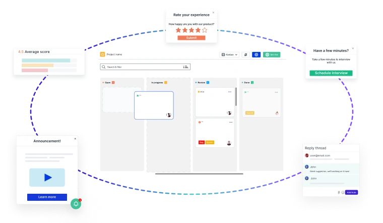
This post was brought to you by Usersnap, which is used by web designers worldwide to design better products. Designers at companies such as Google, Microsoft or Facebook use Usersnap to work together, give feedback and exchange design and product ideas.
If you want to give Usersnap a try, we have a 15-Day free trial for you! Just sign up here and get working on these 2025 design trends already! ??
Accelerate Issue Resolution with Visual Bug Reporting
Identify, capture, and resolve issues faster with screen recordings, screenshots, and contextual feedback—seamlessly integrated into your product development lifecycle.
And if you’re ready to try out a visual bug tracking and feedback solution, Usersnap offers a free trial. Sign up today or book a demo with our feedback specialists.